
Color Contrast with Geometric Tiles
There’s a design revolution happening under your feet—and it’s geometric, stylish, and stunningly smart. Whether you’re dreaming up your next luxury home makeover or just refreshing a single space, there’s one design trick that’s stealing the spotlight in the world of interiors: color contrast through Geometric Tiles.
At Ceramic Fashion Studio, we believe flooring isn’t just functional—it’s fashion for your home. And nothing expresses personality, depth, and distinction quite like the perfect interplay of bold and subtle colors woven into elegant Geometric Tiles.
Let’s dive into how you can elevate any space using color contrasts in Designer Tiles for Floor—and why this trend is here to stay.
Why Color Contrast Works So Well in Geometric Tiles
Color contrast is a visual conversation—it draws attention, guides the eye, and sets the emotional tone of a space. When paired with geometric patterns, the impact multiplies.
Here’s why this combo is magic:
- Balance: Bold hues create focal points, while subtle tones provide breathing room.
- Depth: Contrasts make spaces look more layered and intentional.
- Versatility: From minimalistic to maximalist, this style fits all aesthetics.
And when you apply these principles using Designer Tiles For Floor, your home doesn’t just look trendy—it looks curated.
Geometric Tiles: The Ultimate Canvas
Unlike plain tiles, Geometric Tiles add dimension through shape and pattern—triangles, hexagons, chevrons, diamonds, and more. They create movement, rhythm, and visual structure, making color combinations even more dynamic.
At Ceramic Fashion Studio, our Floor Decor Vol. 4 and Curio V3.0 collections are full of jaw-dropping examples where bold meets calm in perfect harmony.
Think:
- Matte charcoal and dusty rose
- Navy blue and ivory
- Deep emerald and sand beige
- Burnt terracotta and pale peach
Whether your vibe is Moroccan chic, contemporary luxe, or Japandi cool—there’s a geometric palette for it.
Where to Use Color-Contrasting Geometric Tiles
Let’s explore a few stunning applications where color contrast transforms your interiors:
1. Living Room Floors with Personality
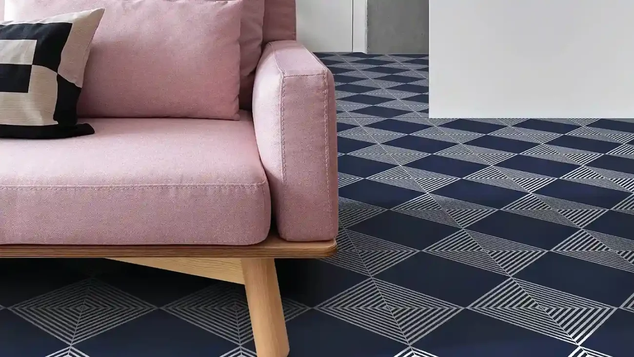
Swap out boring greys and safe neutrals. A zigzag tile pattern in black and cream, or navy with powder blue accents, turns your floor into art. Bonus: these combinations are bold enough to stand alone, so you can keep your furniture minimal.
2. Statement Kitchens
The kitchen is the heart of the home—and the floor can be the heartbeat. Use high-contrast Geometric Tiles (like monochrome or jewel tones) under the island or breakfast nook to define the space.
Pro tip: Pair with light cabinets to keep the look classy, not chaotic.
3. Bathrooms that Belong on Pinterest
Want spa vibes with edge? Choose Geometric Tiles in soft pastels like mint or blush, contrasted with rich tones like charcoal or navy. Install them on the floor or even create a feature wall in the shower zone.
4. Hallways & Entryways
First impressions count. Create a dramatic entrance with bold and subtle floor tiles that welcome guests in style. Chevron patterns or honeycomb shapes in contrasting tones guide the eye and add flow.
5. Outdoor & Balcony Areas
Yes, geometric contrast can work outdoors, too! Use earthy hues like rust, stone grey, and ochre for a warm, rustic aesthetic, or go coastal with white-and-blue combos.
How to Master the Bold + Subtle Balance
Color contrast is powerful—but like all good things, it’s best in balance. Here’s how to get it right:
Rule 1: Stick to a Palette
Choose 2–3 main colors. Let one be bold (like emerald green) and the others more muted (like beige or off-white). This keeps the overall look sophisticated.
Rule 2: Think in Zones
Use contrast to define areas within open spaces. For example, a dark-bordered tile layout around the dining space instantly anchors it without walls.
Rule 3: Match with Materials
Marry your tile colors with your furniture or textures—wood, metal, fabric. If your flooring has dark navy accents, echo that with velvet cushions or metal fixtures.
Rule 4: Let Patterns Do the Talking
Sometimes the pattern itself can create contrast. Use bold geometric forms in subtle colors, or simple shapes in high-contrast shades.
Trending Color Combos in Geometric Tiles
Want to stay ahead of the curve? Here are some of the hottest combinations we’re loving at Ceramic Fashion Studio:
- Black + White + Gold Vein – Timeless luxury
- Emerald + Sand + Blush – Earthy elegance
- Terracotta + Olive Green + Ivory – Warm and rooted
- Navy + Grey + Brass Accents – Bold modern
- Blush + Stone + Dove Grey – Soft sophistication
Our Designer Tiles For Floor aren’t just inspired by trends—they’re setting them.
Why Choose Ceramic Fashion Studio?
Because we’re not just about tiles—we’re about vision.
At Ceramic Fashion Studio, every tile is a statement piece. Whether you’re seeking contemporary minimalism or ornate grandeur, we offer:
- Curated collections from leading designers
- Unmatched craftsmanship
- Geometric Tiles in premium finishes, sizes, and textures
- The kind of Designer Tiles For Floor that makes your space memorable
And our collections are constantly evolving, keeping you in sync with international design trends and homegrown innovations.
Real Design, Real Homes
Let’s talk about Priya, a homeowner in Pune. She wanted a floor that was “playful yet poised” for her open kitchen. She chose a geometric tile design from our Curio collection with a pattern of soft sand and bold forest green diamonds.
“Everyone asks if I had a designer plan my space,” she laughs. “It’s all on the floor. The colors do the storytelling.”
Then there’s Aarav from Chennai, who renovated his ancestral home’s living room. Using hexagonal tiles in black, ivory, and wine red, he turned the floor into a focal point—modern, yet rooted in Indian geometry.
These aren’t just renovations—they’re reflections of personality, creativity, and confidence.
Mood Board Inspiration: Create Your Look
Not sure where to start? Here’s a quick mood board approach to pairing color contrast with Geometric Tiles:
The Urban Classic
- Color Palette: Charcoal, brass, white
- Style: Minimalist business-luxe
- Tile Shape: Chevron or grid
- Pair with: Glass, concrete, chrome
The Warm Modern
- Color Palette: Terracotta, pink clay, beige
- Style: Cozy but clean
- Tile Shape: Diamond or hex
- Pair with: Cane, matte black metal
The Nordic Dream
- Color Palette: Ice blue, ash grey, off-white
- Style: Scandinavian minimal
- Tile Shape: Triangles or small hexes
- Pair with: Pine wood, frosted glass
And guess what? You can build all of this with Designer Tiles for Floor from Ceramic Fashion Studio.
Ready to Shop the Look?
Your perfect space starts with a perfect foundation. Whether you’re revamping one room or building your dream home from scratch, remember: the floor is your fifth wall. Treat it like art.
Browse our latest collections—including Floor Decor Vol. 4 and Curio V3.0—and discover how Geometric Tiles can bring your color vision to life.
Need a little guidance? Our design consultants are just a call away. Let’s turn bold and subtle into your signature style.
Final Thoughts
Contrasts aren’t just about color—they’re about character. They’re the balance between excitement and calm, drama and elegance. And when applied thoughtfully through Geometric Tiles, they elevate your space from simply beautiful to unforgettably chic.
At Ceramic Fashion Studio, we’re not just designing floors—we’re designing possibilities. Let us help you create a space that’s not only trendy but timeless.
So, are you ready to walk on a masterpiece?